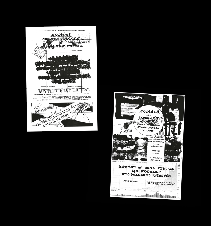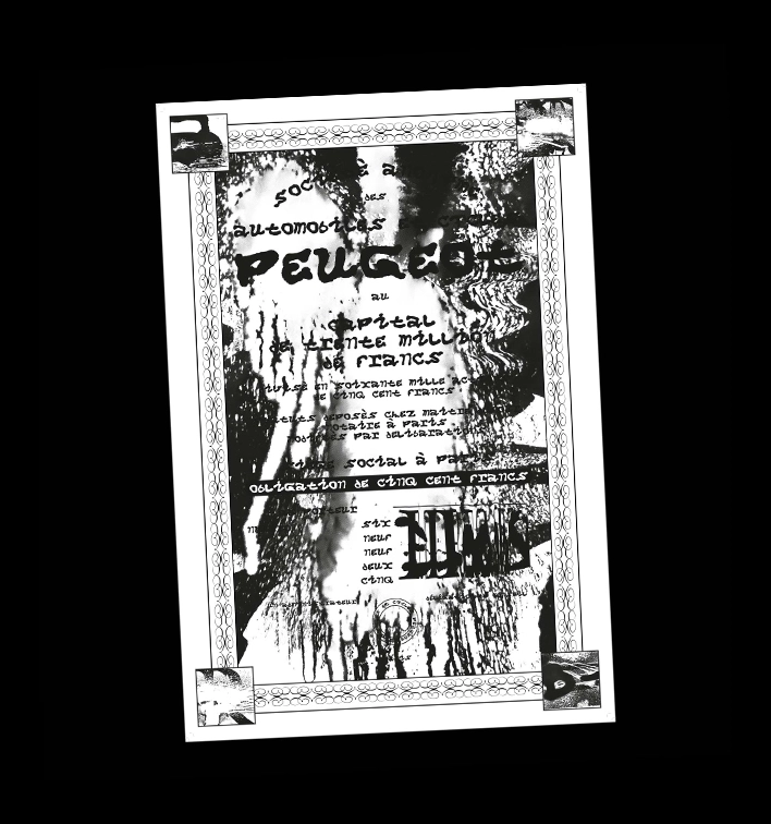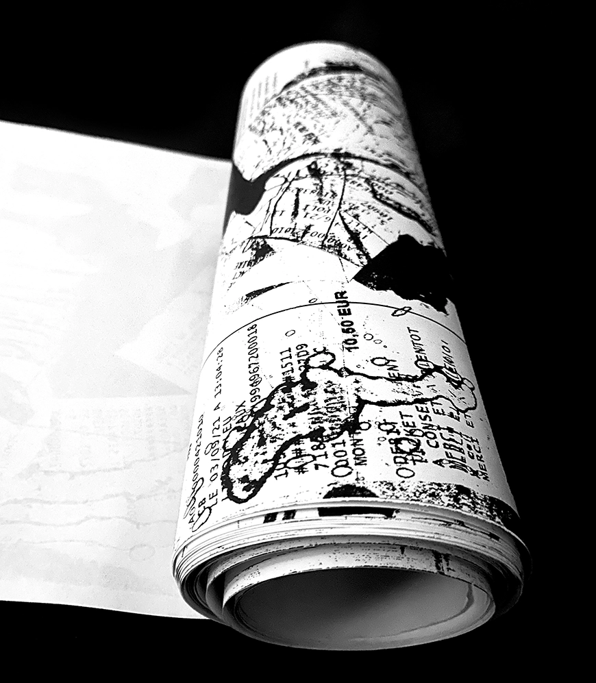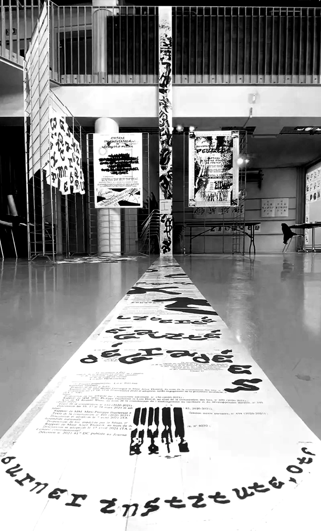
✶ Burner institute, typographie inspiré d'un caractère, parchemin : 210 × 8300 mm, posters : 1200 × 800 mm, papier thermique imprimé avec un fax, 2021.
Burner institute est un spécimen basé sur un caractère imprimé avec un fax sur un papier thermique de 205 × 8985 mm. Résultat d'un workshop dirigé
par Rozenn Voyer et Clément Faydit (Traduttore, traditore). Collaboration entre Aurélien,Brigaud, Romain Marc, Antoine Jarno et moi-même.
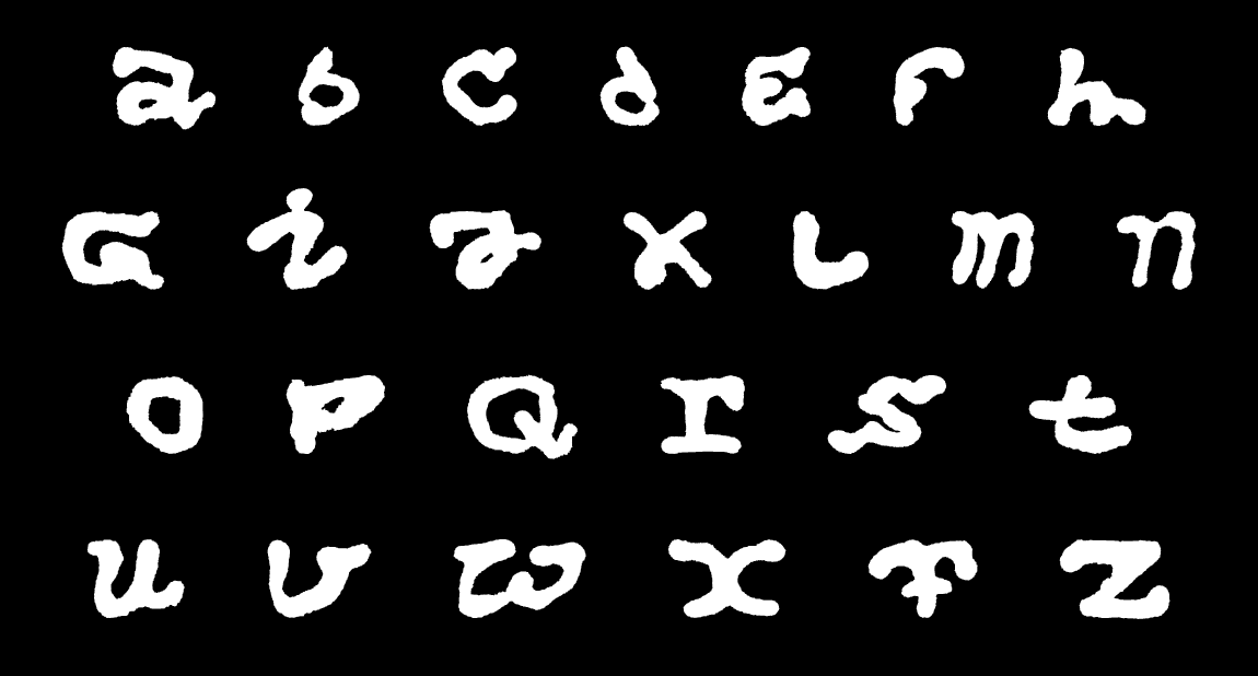
Lors cette semaine, nous avons réfléchis autour de la question de la représentation d'une personnalité dans la typographie. Il était demandé
de questionner les notions ‹ Character, character ›. Caractères humains et caractères typographiques, alors, s'oppose et se rejoignent entre dichotomie et symbiose.
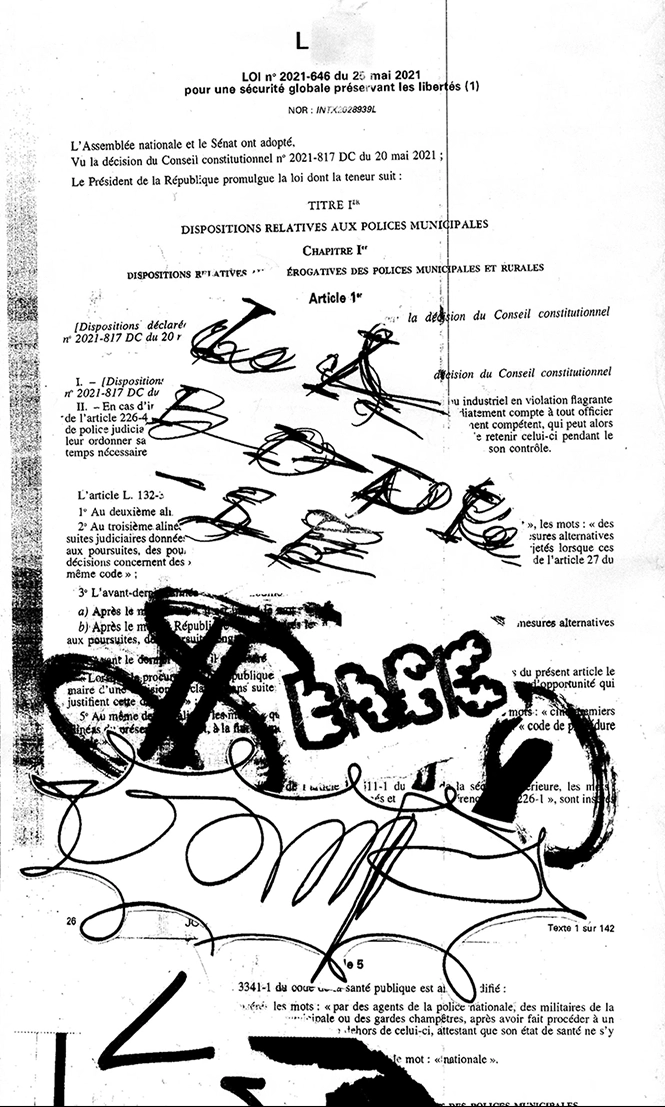
En nous inspirant de l’histoire du graffeur Vamp est née l’idée d’une fonte s’inscrivant dans une dualité entre l'opposition de la dégradation
et des écritures institutionnelles. Le dessin des caractères s’est fait sur papier thermo-sensible, au briquet. C'est par la destruction,
la dégradation que s'est créé cet alphabet. Inspiré des pratiques de collages, graffitis et de l’écriture au noir de bougie. Ce personnage, au premier abord
dans les marges, cache une histoire qui était en opposition avec sa vie ‹ ordinaire ›. Travailleur le jour, il graffait les murs de la ville de Londres la nuit.
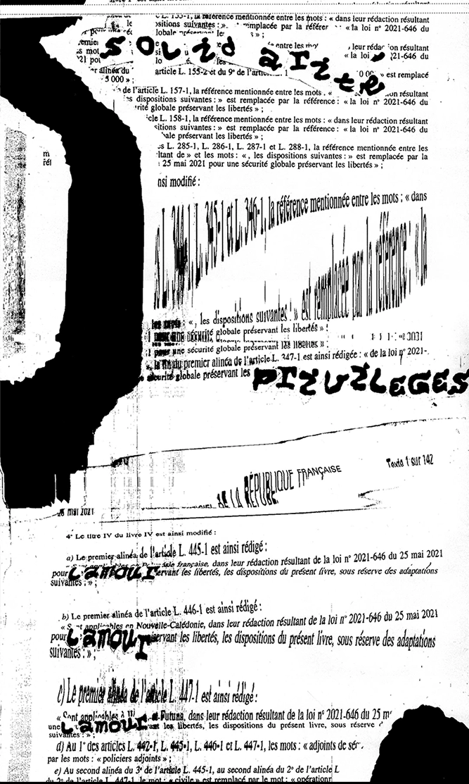
Nous avons choisi de poser un regard critique en remplaçant certains mots ou expressions comme un hack de cette loi controversé.
Caractères, expérimentations et collages ont été alors utilisés pour annoter cet exemplaire de la loi.